
Understand goals, audience, context, source material and communication priorities.
Research Visual Summary Service for Clear, Compelling Research Communication
Turn complex research into visuals people can understand, remember and act on.
We transform dense papers, findings, evidence and data into concise visual summaries that preserve the research message while making it easier for academic, policy, funding, institutional and public audiences to engage with the work.
- Clarify complex findings without losing context
- Build evidence-led visual narratives for target audiences
- Convert data into readable charts, diagrams and infographics
- Create reusable assets for reports, presentations and outreach
Our Impact by the Numbers
Our Proven 6-Stage Process
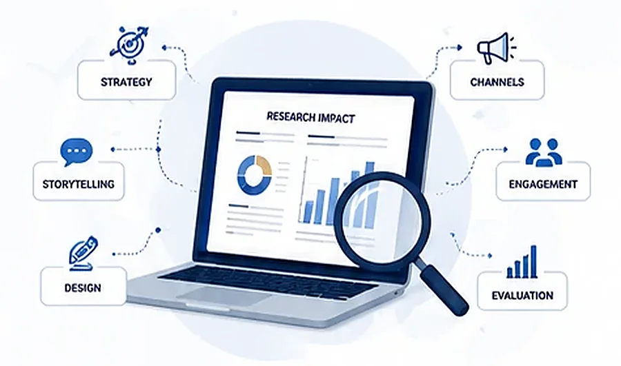
A structured workflow moves from understanding the research to building the visual story, packaging it for the right channels and evaluating how it performs.
Review the evidence, identify the central findings, qualifiers, patterns and key messages.
Define the narrative, information hierarchy, audience emphasis, format and channel plan.
Build the visual summary, copy, charts, diagrams, layout and supporting communication assets.
Package outputs for websites, reports, presentations, events, email and social communication.
Define useful measures, review performance and refine the communication approach where included.
What We Do
Research visual summaries are built by combining evidence synthesis, concise writing, visual communication and presentation design—not by simply decorating a report.
Research Narrative Development
Shape the central story, message sequence and audience logic behind the visual summary.
Scientific & Executive Summary Writing
Translate complex evidence into concise copy for research, decision and public-facing contexts.
Data Visualisation & Charts
Choose clear chart forms and visual emphasis so evidence is easier to read and compare.
Infographic & Visual Brief Design
Combine findings, icons, charts, callouts and hierarchy into a coherent visual summary.
Presentation & Slide Communication
Adapt research messages into presentation-ready layouts for briefings, workshops and events.
Multi-Channel Content Adaptation
Prepare the same core research story for web, reports, publications, email, social and events.
Our Tools & Capabilities
The workflow combines analysis, visual design and content systems so research can move from source evidence to polished, reusable communication assets.
Tools we use: Tableau • Power BI • Illustrator • InDesign • Canva Pro • Figma • WordPress • Google Analytics • Mailchimp • and more
Key Deliverables & Multi-Channel Distribution
Choose a focused visual summary or build a coordinated set of assets that carries the same research story across the channels that matter to your audience.
Key Deliverables
- Research visual summaries & plain-language visual briefs
- Graphical abstracts & research infographics
- Data visualisations, charts, diagrams & frameworks
- Research posters & conference visuals
- Executive summaries, fact sheets & evidence briefs
- Presentation & pitch decks
- Web-ready research summaries and landing-page visuals
- Social media visual content & campaign assets
- Impact reports & dashboard-ready communication outputs
Multi-Channel Distribution
to the Right
Audience
Our Impact Framework
Connect the evidence behind the work to the communication activity, visible outputs, intended outcomes and wider impact you want the research to support.
Who We Help & Use Cases
The same underlying research can require very different visual emphasis depending on whether the goal is academic visibility, health communication, policy influence, funding, public awareness or corporate reporting.
Academic Research
Increase visibility, citations and collaboration opportunities with clear research-facing visuals.
Health & Science
Communicate findings clearly to improve understanding of scientific and health outcomes.
Policy & Advocacy
Structure evidence for policy audiences using concise, decision-oriented visual communication.
Grants & Funding
Strengthen proposals, reporting and donor communication with visual evidence of purpose and impact.
Public Awareness
Make complex evidence easier to understand for communities, media and broader public audiences.
Corporate & ESG
Present sustainability, impact, innovation and research findings in a clear stakeholder-ready format.
Engagement Models & Typical Timeline
Choose a one-off visual summary or a broader communication engagement. The timeline below reflects the supplied engagement model and can be shaped around the agreed scope.
Engagement Models
Typical Engagement Timeline
Why Choose Us?
The strongest visual summary is both visually engaging and faithful to the research. Our approach combines subject understanding, evidence discipline, design quality and audience fit.
Research Visual Summary Service FAQs
Answers to common questions about source material, visual formats, data visualisation, accuracy, audience adaptation, timelines and project scoping.
What is a Research Visual Summary Service?
It converts complex research, evidence and data into concise visual communication assets such as visual briefs, infographics, graphical abstracts, slide-ready summaries and data visualisations while keeping the research message and context clear.
What source material can you work from?
The service can be scoped around research papers, reports, evidence reviews, project findings, presentation decks, tables, charts, structured data and supporting communication material supplied for the project.
What visual summary deliverables can I request?
Depending on the brief, deliverables can include research visual summaries, graphical abstracts, infographics, data visualisations, visual executive briefs, research posters, presentation decks, web-ready research summaries and social communication assets.
How do you preserve scientific and research accuracy?
The workflow begins with source review and evidence analysis, then uses structured messaging, visual design and review stages so that key findings, qualifiers, labels and context can be checked against the supplied research before delivery.
Can one research project be adapted for different audiences?
Yes. The same research can be structured into different visual formats for researchers, decision-makers, funders, policy audiences, students, partners or public audiences when those audience needs are included in the project scope.
Can you use our branding or publication guidelines?
Yes. Brand, publication, funder or institutional guidance supplied with the project can be incorporated into layout, typography, colour, logo placement and output formatting.
Can you create charts and data visualisations?
Yes, where suitable source data is supplied. The visualisation scope can include charts, comparison graphics, process diagrams, frameworks and other visual devices that help explain findings accurately.
What is the typical engagement timeline?
The service model shown on this page uses discovery and research in weeks 1–2, strategy and planning in weeks 3–4, content creation and design in weeks 5–8, distribution and launch in weeks 9–10, followed by ongoing evaluation and optimisation where included.
How is pricing determined?
Pricing is quoted to the project because scope can vary by source-material volume, number and type of visual assets, data work, design complexity, review requirements, output formats and deadline.
Can you prepare versions for web, presentations and social channels?
Yes. Multi-format and multi-channel adaptation can be included so the same core research story works across websites, reports, publications, presentations, events, email and social communication.
What do you need from me to start?
Provide the research source material, key findings or messages, intended audience, preferred deliverables, brand or publication guidelines, required output formats and any deadline or launch date.
Can the service support impact reporting and evaluation?
Yes, where included in scope. The communication assets can be connected to an impact framework and measurement plan so outputs, audience reach, engagement and intended outcomes are easier to communicate and evaluate.
Discuss Your Research Visual Summary Requirement
Tell us what research you need to communicate, who needs to understand it and which visual formats or channels matter. We can scope the most suitable deliverables around your source material and communication goal.
What to Share for a Useful Project Discussion
A strong brief helps align the evidence, message, audience and visual format from the start.
Paper, report, evidence review, slide deck, structured data, tables or other source material.
Who needs to understand the research and what should they know, feel, decide or do?
Visual summary, graphical abstract, infographic, deck, poster, data visualisation or multi-channel asset set.
Brand or publication requirements, output sizes, format constraints, review needs and any launch date.
Request a Project Discussion
Share your contact details and a concise overview of the research, audience and visual outputs you need.
Let’s Amplify Your Research & Maximize Your Impact.
From evidence synthesis to visual storytelling, we help your research reach the right audience in a form they can use.
Discuss Your Requirement