
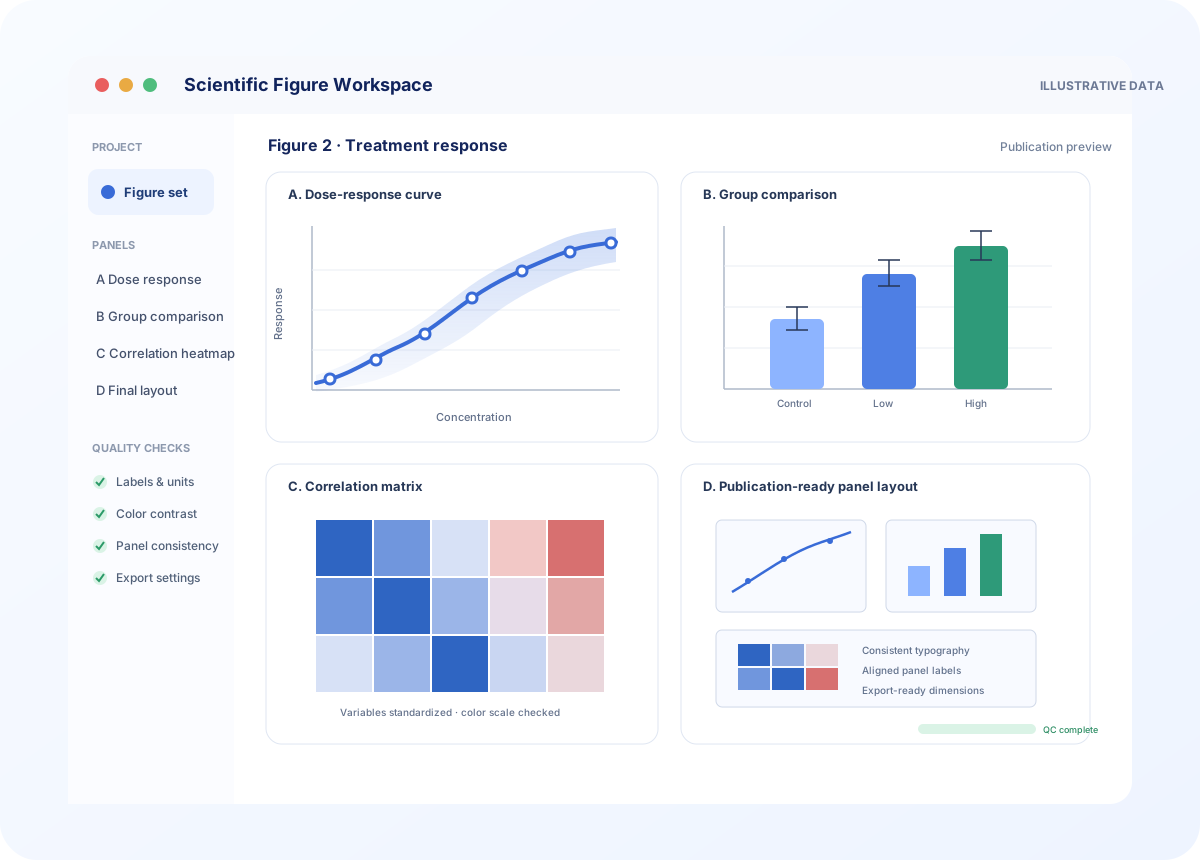
For results that are already plotted but need journal-grade visual cleanup and consistency.
₹3,000
up to 3 existing charts- Axis, label, unit, legend, and typography refinement
- Colour and contrast review for scientific readability
- Consistent sizing and export settings across three charts
- High-resolution final files for the agreed use