
Wrong Chart Choice
The visual form may not match the question the data is meant to answer.
Turn supplied market research data, industry findings, comparisons, trends, segments, regional results, and forecast tables into a visual story that is easier to read, compare, and use inside professional reports.
Visual form matched to comparison, trend, ranking, composition, or distribution.
Labels, scales, units, captions, and visual styling reviewed as a system.
Source notes, assumptions, figure labels, and supplied definitions stay visible.
Files move through a structured scope, visualization, QA, and delivery workflow.
Strong analysis can still be hard to use when chart choices, scales, labels, source notes, or visual hierarchy make the evidence difficult to compare.
The visual form may not match the question the data is meant to answer.
Important comparisons disappear inside large rows of numbers and repeated categories.
Axes, units, periods, or baselines can make side-by-side visuals difficult to interpret.
Time-series movement is shown without enough hierarchy to reveal the intended pattern.
Figure styling may not align with the surrounding report, template, or section structure.
Definitions, assumptions, units, or source references may be separated from the figure they support.
The workflow follows the structure of the report: understand the source, decide the visual job, build the figure, align it to the report, check it, and prepare the agreed output.
Tables, files, report sections and visual requirements.
Understand fields, units, periods, definitions and notes.
Choose visual forms for comparison, trend, share and ranking.
Construct figures with clear axes, labels and legends.
Match supplied typography, colors, captions and layout.
Improve hierarchy, emphasis, spacing and comparison cues.
Check values, scales, units, labels, notes and consistency.
Prepare the agreed report-ready figure set or visual pages.
Deliver confirmed files with scope-specific follow-up.
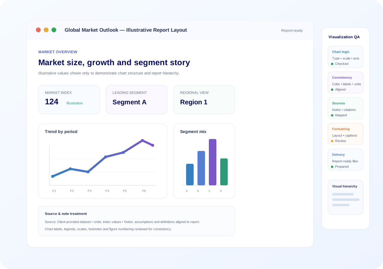
This illustrative example shows the service journey without presenting any real market claim: a dense table becomes a readable chart and then a report-aligned visual page.
A source table can contain the right values but still make comparison slow.
| Segment | P1 | P2 | P3 |
|---|---|---|---|
| A | 42 | 47 | 51 |
| B | 36 | 41 | 44 |
| C | 29 | 33 | 39 |
| D | 24 | 28 | 31 |
A chart can reveal the comparison faster when the scale, labels, hierarchy, and color logic are controlled.
Visual hierarchy, figure title, chart area, caption, units, source note and surrounding report spacing aligned.
The core service goes beyond drawing a chart: it considers chart purpose, report context, visual consistency, source-note treatment, and final figure quality.
The figure plan can follow the report from executive-level findings through market structure, segmentation, competitive evidence, trends, forecasts, and supporting methodology.
Headline findings and decision-level visual cues.
Historical movement, growth patterns and period comparisons.
Category, product, customer or channel comparisons.
Competitor, share, positioning or benchmark views.
Country, region, territory or geographic comparisons.
Movement, drivers, barriers, opportunities and patterns.
Historical-versus-forecast series when supplied.
Figure notes, definitions, assumptions and source treatment.
Supporting tables, figures and detailed evidence.
Each project moves through a defined sequence so chart creation remains connected to the source data, report objective, formatting context, and final quality review.
Share report, tables, data and available instructions.
Assess number of visuals, data condition and outputs.
Map each figure to its analytical purpose.
Create clear chart structures and visual hierarchy.
Align typography, colors, captions and spacing.
Cross-check plotted values against supplied source data.
Review units, legends, labels, scales and notes.
Prepare the confirmed report-ready output set.
Address agreed scope-specific follow-up after delivery.
Final deliverables depend on the confirmed project scope and working format. The items below describe typical output categories that can be agreed for a market or industry report visualization project.
Figures prepared to match the agreed report context, style, labels, and captions.
Output formats confirmed according to the document, presentation, or publishing workflow.
Figure labeling and source-note treatment aligned to the supplied report conventions.
Common chart styling, typography, color logic, spacing, and hierarchy across the set.
Values, scales, labels, units, legends, captions, and source notes reviewed before delivery.
Confirmed files organized for the agreed report, presentation, or downstream workflow.
Visualization QA is not only a design check. It considers the connection between the supplied values, chart logic, labels, units, report presentation, and final output.
Match plotted values and categories to the supplied data.
Check visual type, axes, baseline, sorting and analytical fit.
Align colors, labels, periods, units, terminology and legends.
Check figure titles, captions, source notes, spacing and report fit.
Complete a last review of the agreed visual set before delivery.
The service can be adapted to market and industry report structures across a range of sectors, provided the relevant data, definitions, and reporting context are supplied.
Biotech, pharma, diagnostics and research markets.
Healthcare services, devices, care and public-health reporting.
Manufacturing, materials, infrastructure and industrial markets.
Software, AI, data, platforms, telecom and digital markets.
Consumer, behavioral, education and social research.
Finance, strategy, management, macro and commercial reports.
Energy, utilities, sustainability, climate and environmental markets.
Policy, infrastructure, demographic and institutional reports.
Market research can contain unpublished commercial analysis, proprietary data, internal assumptions, or client-sensitive material. Handling expectations should be stated with the project.
No fixed turnaround is published for this non-catalogue service. Delivery is confirmed after the data condition, number of visuals, complexity, output format, and deadline are reviewed.
For planned report-development work where scope, data, and visual requirements can be reviewed before production begins.
Timeline confirmed after reviewFor projects with a closer deadline that may need earlier scheduling, subject to the confirmed workload and visual complexity.
Availability checked at quote stageFor urgent requirements where the requested deadline is reviewed against chart count, data condition, formatting depth, and available capacity.
Feasibility confirmed before workThis service does not match the supplied Editing, Writing, or Proofreading plan catalogue, so no catalogue price is applied. Pricing is quoted only after the actual visualization scope is reviewed.
Share the report, source files, approximate chart count, output format, and deadline so the project can be scoped without inventing a fixed package price.
Request a Custom QuoteThe focus is not decorative charting. It is a report-centered workflow that keeps the visual connected to the data, analytical message, figure conventions, and surrounding document.
Figure 4. Segment comparison by reporting period
These questions focus on how market and industry report visualization is scoped, reviewed, priced, and prepared for delivery.
The service focuses on turning supplied market, industry, competitor, segment, regional, trend, survey, forecast, and supporting report data into clear report-ready charts and visual layouts. The exact chart set and output format are confirmed after the files and reporting requirements are reviewed.
Yes. You can provide an existing report together with the underlying tables, spreadsheets, or source files. The visual scope can then be planned around the report structure, key messages, figure numbering, and the sections that need stronger visual communication.
Yes, when the data is supplied in a usable spreadsheet or tabular format. If the source file needs significant cleanup, restructuring, or reconciliation, that work should be identified during scope review so it can be handled appropriately.
Depending on the data and report purpose, visuals may include market-size and growth charts, segment comparisons, regional views, competitor comparisons, trend lines, distribution charts, matrices, timelines, tables, and other report-appropriate figure formats.
Yes, when you provide the applicable report template, brand guide, color palette, typography rules, or sample pages. The goal is to align new visuals with the supplied presentation system rather than introduce a conflicting visual language.
Chart selection is based on the analytical task the visual needs to perform—for example comparison, composition, change over time, ranking, distribution, relationship, or geographic variation—together with the structure and limitations of the supplied data.
These presentation elements can be reviewed as part of visualization quality control. The supplied source material remains the basis for factual values, definitions, assumptions, units, and source attribution.
Yes, when forecast values, periods, assumptions, and definitions are provided. Forecast and historical series should be clearly distinguished in the visual design so the report does not blur actual and projected information.
Confidential and unpublished files should be shared only through the designated service process. The reference ContentXprtz workflow uses controlled handling for client files; any additional confidentiality or NDA requirement should be stated with the enquiry.
The final format depends on the project scope and the tools needed for the report. Typical report-ready requirements may involve presentation-ready charts, document-ready graphics, or editable working files where the confirmed workflow supports them.
Turnaround is confirmed after reviewing the number of visuals, data condition, chart complexity, formatting requirements, source-note needs, requested output formats, and deadline. No fixed turnaround is assumed on this page.
Pricing is quoted for the specific project after scope review. Relevant factors include data volume, number and complexity of charts, cleanup required, report-formatting depth, revision needs, output formats, and requested turnaround.
Tell us what report you are preparing, what data you have, how many visuals you expect, what format you need, and when the final material is required.
Describe the report type and the spreadsheets, tables, or source files available.
Share the estimated number of charts, visual pages, or report sections that need work.
State whether the visuals are for a report, presentation, document, publication, or another workflow.
Provide the required delivery date and time zone so feasibility can be checked.
Mention proprietary, embargoed, unpublished, or NDA requirements before sensitive file transfer.
Share enough information to review the visualization scope. Do not paste confidential datasets into this form.