Wrong Chart for the Question
A visual may be technically correct but still make comparison, composition, change, or distribution harder to interpret.
Turn dense market data, segmentation tables, competitor benchmarks, survey findings, growth trends, and forecast series into clear visual stories that are easier to read, compare, and use inside professional reports.
Charts built around the question your data must answer
Visuals shaped to work inside market and industry reports
Source, scale, label, legend and consistency checks
Work from report drafts, tables, spreadsheets and supplied data
Sensitive report files and unpublished analysis treated carefully
Strong analysis can still be difficult to use when the chart type, scales, labels, hierarchy, or narrative emphasis do not make the insight obvious to the reader.
A visual may be technically correct but still make comparison, composition, change, or distribution harder to interpret.
Mixed units, truncated axes, or inconsistent intervals can make comparisons confusing or visually misleading.
When every element competes for attention, the reader cannot quickly see the most important trend, gap, or segment.
Missing units, vague legends, crowded labels, or detached source notes reduce confidence in how a figure should be read.
Charts placed without context or annotation can become decoration instead of evidence that supports the report's conclusion.
A complete visualization workflow can move from source-data understanding to chart strategy, visual standardization, report integration, review, and delivery.
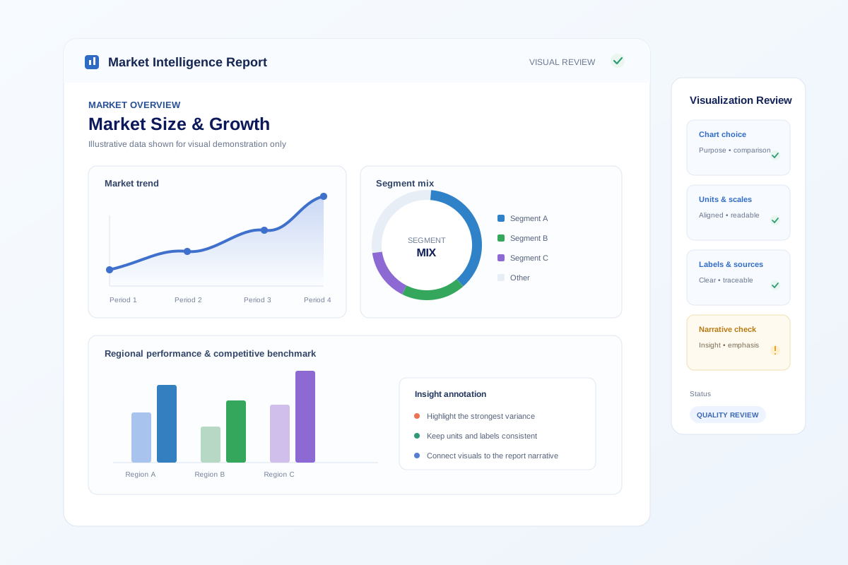
The examples below are illustrative. They show how the same underlying information can move from a difficult-to-read presentation to a consistent, annotated, report-ready visual.
Too many colours, weak labeling, inconsistent ordering, and no clear analytical emphasis.
Categories are ordered, colour is purposeful, units are aligned, and the comparison is visually cleaner.
The final visual directs attention to the key contrast and adds a concise annotation without overwhelming the figure.
The level of support should match the complexity of the report. This comparison shows how the focus changes from simple chart creation to structured report-wide visual communication.
| Focus | Basic DIY Charting | Report Visualization Support | Advanced Visual Support |
|---|---|---|---|
| Chart choice | User-selected | Matched to analytical purpose | Purpose + narrative emphasis |
| Data presentation checks | Basic | Units, labels, scales, legends | Includes deeper cross-visual consistency |
| Visual hierarchy | Limited | Structured for report reading | Enhanced storytelling and annotation |
| Cross-chart consistency | Manual | Standardized visual system | Report-wide visual language |
| Report integration | Manual placement | Captions, numbering, figure fit | Strategic figure sequencing |
| Best for | Simple one-off visuals | Most market and industry reports | Complex reports with dense analytical storytelling |
Visualization is most useful when it is planned around the report's analytical structure, not added after the writing is complete.
The workflow keeps the analysis, visual design, report context, and quality review connected from the first data handoff through final delivery.
Deliverables are shaped around the agreed report scope and output requirements, with a focus on visuals that can be used clearly and consistently in the final market or industry report.
Visuals prepared for integration into the agreed market or industry report.
Consistent chart styling, labels, units, legends, and visual hierarchy across the report.
Presentation support for figure naming, source notes, annotations, and reading cues where required.
Flags or clarification points where supplied data, units, labels, or comparison logic need confirmation.
Placement-ready visual components aligned to section context, numbering, and report structure.
Final files prepared in the formats confirmed during scoping; editable source delivery can be discussed where applicable.
Multi-stage review helps keep each chart accurate to the supplied source, visually consistent, and aligned with the way the report explains the finding.
Values, units, categories, and periods are checked against the supplied source material.
Terminology, units, decimal handling, colours, legends, and style are reviewed across visuals.
Chart type, axes, scale, ordering, and comparison logic are checked for readability.
Figure numbering, captions, source notes, cross-references, and section placement are reviewed.
A final visual pass checks presentation consistency, readability, and completeness before delivery.
The visualization approach can be adapted to different report contexts, provided the underlying data, analytical purpose, and terminology are supplied clearly.
Market studies, unpublished analysis, client research, and competitive information can be sensitive. File handling should reflect that sensitivity throughout the project.
No fixed turnaround has been supplied for this service. The delivery schedule should therefore be confirmed after reviewing the data volume, number of visuals, complexity, source condition, output formats, and deadline.
Best for planned reports where the visualization scope can move through chart development, consistency review, and final verification in sequence. Exact timing is confirmed after scope review.
For nearer report deadlines, priority handling can be discussed before the work starts. Availability and the achievable review depth depend on the agreed scope.
Expedited requests can be assessed against data readiness, visual complexity, and current capacity. A deadline should be confirmed before the project is accepted.
This service does not match the supplied Editing, Writing, or Proofreading plan catalogue, so no catalogue price has been applied. A custom quote is the appropriate presentation for a variable data-visualization scope.
The quote can be shaped around the size and condition of the source data, the number and type of visuals, visual complexity, report integration requirements, output formats, and agreed turnaround.
A clearer scope makes it easier to define the right visualization approach and quote.
Request a QuoteThe goal is not decorative charting. The work should help the reader understand the evidence, compare the right things, and connect the visual to the report's analytical message.
Use one visual language for historical and forecast periods.
Order categories consistently and reserve emphasis for the key comparison.
Keep units and scales aligned so the reader can compare like with like.
Use concise notes to explain the meaning of a visual, not to repeat every value.
Common questions about scope, data inputs, chart redesign, report integration, pricing, turnaround, and quality review.
It is professional support for turning market research data, tables, comparisons, trends, forecasts, and analytical findings into clear charts and report-ready visual structures that help readers understand the evidence and the message.
The service can work with structured report data such as market sizing, growth trends, segmentation, regional comparisons, competitor benchmarks, survey results, pricing comparisons, and forecast series, provided the source data and context are supplied.
Yes. Existing charts can be reviewed for chart choice, hierarchy, labels, scales, consistency, annotation, readability, and alignment with the surrounding report narrative.
Yes. Tables or spreadsheet-based source data can be assessed and translated into appropriate charts or structured visual summaries when the data is sufficiently clear and complete.
The visualization process is intended to present supplied data clearly, not to invent or alter findings. Any inconsistency, missing unit, unclear label, or data issue identified during review should be flagged for clarification rather than silently changed.
Market size, growth rates, and forecast series can be visualized when the underlying values, periods, units, and methodology context are supplied. The emphasis is on clear presentation and consistent scales.
Yes. Competitor, region, country, segment, product, and category comparisons can be structured visually when the comparison basis and source data are provided.
If report, publisher, client, or brand guidelines are supplied, the visual system can be aligned to those requirements, including typography, chart styling, labels, figure numbering, and presentation conventions.
Useful inputs include the report or draft, source tables or spreadsheets, chart requirements, intended audience, style or brand guidance, preferred output format, deadline, and any visuals that need redesign or standardization.
Quality review can include source-to-chart checks, label and unit consistency, scale and legend review, visual hierarchy, figure and table consistency, cross-reference checks, and a final presentation review.
Turnaround depends on the volume and condition of the data, the number and complexity of visuals, required formats, review cycles, and the delivery deadline. A timeline should be confirmed after the scope is reviewed.
Pricing is scoped as a custom project quote because the amount of data, number of visuals, complexity, source condition, output requirements, and turnaround can vary substantially between reports.
Share the report context, data format, approximate number of visuals, deadline, output requirements, and any existing charts that need redesign or standardization.
Tell us the report type, target audience, and how the visuals will be used.
Describe the spreadsheets, tables, survey data, research outputs, or draft figures available.
Estimate the number of charts, tables, maps, comparisons, or report sections involved.
Include any client, publisher, brand, or internal presentation guidance that must be followed.
Specify the formats you need for report integration, presentation, or further editing.
Share the deadline and identify the most important visuals or report sections.
Share your contact details and project requirements so the report and data can be reviewed for scope, visualization complexity, and deadline feasibility.